“Make my logo bigger!” It’s a request from clients so common, in fact, it has spurred entire parody websites, browser plugins, and even music videos.
While this type of request certainly isn’t without merit, I often find that it is missing the strategic ‘WHY’ behind the request.
Bigger isn’t always better
One designer recommends considering what has a higher perceived value – “32oz mug of coffee or a small cup of espresso? A 5 Ton truck or a 1 ton sports car? A big fat marker or a fine ball point pen?” A common response however is still, “it’s just too small.”
Let’s have a look at some major brands online, and how their logo sizes measure-up.
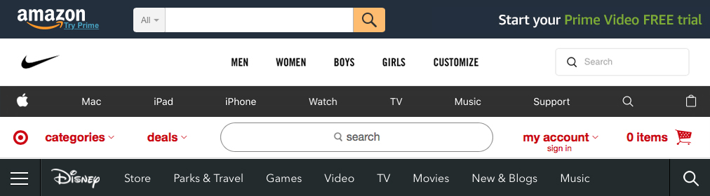
Amazon: 116 x 29
Nike: 55 x 21
Apple: 17 x 20
Target: 22 x 21
Disney: 69 x 28
Quite small, right?
“But what about Google?” a client may quip. Sure, their homepage features a large version of their logo sometimes, but keep in mind there isn’t any other content for a user to consume on the page. Moreover, Google’s other action items are very clear, few in number, and surrounded by ample whitespace. So, at that point, the question is really ”Why not make the logo bigger?!”.
![]()
Draw attention to what really matters
On every other Google product page, as well as search result pages, the logo is reduced to a mere 95 x 41.
That’s because the goal of those pages–as well as most others–is to allow a user to complete a task as quickly and efficiently as possible. And that means not distracting attention with a big logo (especially over and over again on every page). I think of it a bit like an in-store shopping experience: imagine if every new page greeted you with “Welcome to Walmart” or bright flashing logo. Pretty annoying, I’d say. After all, you probably know where you are.
Even if a user has zero knowledge about who you are–and regardless of your effort to convert them to as a follower, buyer, or donor–the user’s goal is to complete a task. Your goal, therefore, should be to help them perform that task as quickly and efficiently as possible, while reinforcing a positive perception of your brand as a whole.
The size of your logo will have no effect on helping a user achieve their goal.
Move along, there’s more to see here.
Eye-tracking has proven that a user’s gaze follows a natural reading pattern which is typically F or E in shape. So, if your logo is in the top left-hand corner, it’s 58.4% more likely that a user will at least notice it.
Ask yourself, what is the order of the things you want people to interact with on your site? Where does your logo fall within that hierarchy? There are plenty of other things vying for attention, so remember the old adage: if you emphasize everything, you therefore emphasize nothing. Focus on using other design tools in your toolbox – shape, color, contrast, space, animation and yes, scale –– to draw a user’s attention to what really matters: your brand’s value proposition, key benefit, ‘Why’ statement or call to action.
Come back soon to learn more about some of these methods in my follow-up post, Focus on what matters: Guiding user attention (Part 2 of 2).
Erick is Taoti’s Creative Director and leads our Creative and UX (CrUX) team. Send us a note to chat with Erick about your upcoming project.
