At Taoti Creative, we’ve had the opportunity to work with many D.C. area clean water agencies, including DC Water, Fairfax Water, Loudoun Water, and ongoing projects for the Washington Suburban Sanitary Commission and Alexandria Renew. While each of these organizations has a shared purpose of supplying clean drinking water and/or sanitary sewer services, each has a unique brand and focus. We wanted to share some of the UX lessons we have learned on these important projects.
A Streamlined UX Helps Mobile Users
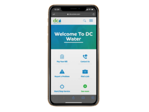
Responsive design allows a website to adjust to various screen sizes, but some websites restack the same content regardless of the device. For DC Water, we discovered our mobile users wanted to pay a bill or report a problem, and any other content simply got in the way. By creating a custom mobile experience focused on these key activities, we improved our overall User Experience.
Plan for Emergencies Big and Small
Even the best-run water organizations will have service disruptions or critical emergencies. Our user experience includes the ability to share urgent information about major issues, like a boil alert, with overlays or alert bars in bright colors at the top of the screen. However, we don’t want to give the user “alarm fatigue” or harm the overall brand by overusing these features, so we also built in more subtle alerts for regular maintenance or minor disruptions.
Aiming for Cohesive (Not Seamless) Experiences
Each water agency we have worked with relies on a third-party system for account management and bill payments. Traditionally, clients have asked for a “seamless” experience, but that is not always possible. The water management systems have limitations to theming and user experience, so we focus on creating a cohesive experience as users go from a public website to a third-party payment processor. Our focus is on usability and brand consistency, rather than one-to-one designs.
Brand Building Has a Place in UX Too
When we started working with municipal water organizations, the term “brand” was not at top of mind.
However, their leaders made it clear that each organization needs substantial investment to maintain water infrastructure, and they will need to ask communities to fund these projects and tolerate the disruptions to roads and services. In each of our sites, we add opportunities to share positive stories, feature staff, and build the organization’s brand.
