This year, the infinitely talented Mason Plunkett (Vice President of Creative Services) and I had the distinct pleasure of being featured speakers at DrupalCon Europe. This year our talk was on the subject of accessibility, and more specifically, how to be WCAG 2.x AAA compliant in your digital work by being specific and intentional with your approach without losing your mind along the way. For those who couldn’t make it to see us (since it kicked off at 3:00am EST we certainly wouldn’t blame you) we just wanted to share a few of the main takeaways that we shared at the conference – enjoy!
Start with “Why”
Don’t aim for AAA compliance for the sake of AAA compliance. Know your goals. Craft a strategy to support them.
We spoke a lot about the importance of listening to your clients when they ask for AAA compliance, but then diving deeper into their needs during Discovery, requirements generation, and technical architecture planning to figure out what their actual goals are for the project. From there, you can help refocus their mindset on which areas of the site should be built for AAA compliance and where you can lean into more unique design and UX choices that might not fully meet AAA criteria but understanding that this sacrifice is perfectly fine.
Celebrate the Beauty
Some designers struggle to reconcile aesthetic preferences with the constraints of an equitable web. Good designers know that accessible design is beautiful design.
We love the example of a doorknob vs. a door handle. A doorknob is a legacy device used to enter buildings which was replaced by the door handle in new building regulations in the mid-1990’s. This is a perfect example of something that was built for accessibility specifically but was just a better design overall. If your design team is ripe with frustration on limitations imposed on them by AAA guidelines, ask them to take a hard step back and go back to the basics – why are you building this component, and how can we make this so simple but still beautiful that it gets the job done and is also `fun` to use. Once you figure out how to make it fun, you’ll find your creative juices start flowing in ways where you can make it simple, compliant, and beautiful.
Think Beyond the Web
Accessible websites are only the beginning. Rooting your brand in trust and equity puts you ahead in a race others don’t even know is happening.
Don’t take our word for it – do your own research on the impact brands have on their audience by including people with disabilities in their marketing campaigns. Everything from daily email newsletters to bus ads, research proves that being more inclusive in your work outside of just your web property garners trust and most importantly, a more stable user/customer base. Users want to know the company they’re visiting/purchasing from is inclusive to all. When a site is accessible to those with disabilities (since most sites aren’t) they receive the traffic that others won’t know is even obtainable, and those users bring their friends and family with them as it’s a source of trust that is instilled within them at a core brand level on what can sometimes be a dark and scary world-wide-web.
Establish a Culture
Build a team that support an accessibility-first mindset so there’s less specialization on the subject internally. Put it in your job ads. Make it as important as billing your clients.
In a perfect world, your accessibility program is not full of `doers` with one main accessibility expert at the helm leading the charge, but instead that specialization is actually non-existent and you wrap accessibility competence into core responsibilities of even your `generalists`. Moving towards this notion of expectation that generalists have this skill and mindset will push your team towards an accessibility 1st culture, rather than one that is just simply considered at certain checkpoints in the project process.
BONUS: Expanding Your Understanding of `the spectrum` of disabilities
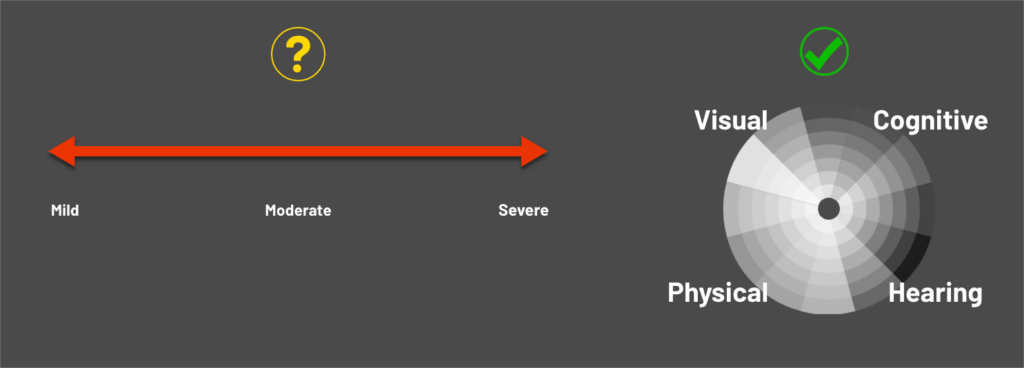
Eliminate the thought that disabilities can be measured on a linear scale, but instead on a much more complex circular spectrum accounting for all combinations and severities of disabilities.
Quick disclaimer: we are not medical professionals and the below is simply a reflection of our expert opinions.
In the presentation, we displayed 2 different visual representations of what experts have coined `the spectrum` of disabilities – one with a conventional straight line(linear) scale that had mild on the left end, moderate in the middle, and sever on the far-right end. The other spectrum we proposed was one that resembled more of a color wheel approach (the colors themselves are irrelevant). The color wheel was used to articulate the idea that it’s not quite as simple as measuring one type of disability – hearing, visual, physical, or cognitive – on a straight line, but instead pulling the data to plot out where on the circular plane each individual user falls. Imagine each disability type covers one quadrant of the sphere, now map severity for each one (closer to the center you get the more severe), and once all 4 data points are established, you have a full picture of the accommodations a user might need (rough render of this idea below). Multiply this by a few hundred to get a good data set, and you’ve got a full picture of where your users fall on the spectrum, and not just 1 simple point on a singular line.

Want to read more about accessibility and everything that goes into it? Take a look at our blogs page located here. Or maybe you’re looking for a more personal conversation? Write us anytime at accessibility@taoti.com – we’d love to chat!