Logos are not really all that big of a deal to make. But if you want to do it right, you need to realize a couple of very key things:
The point of a logo is to provide a visual element that people can look at and instantly recognize. Bonus points if the logo somehow reflects what you do or in some other way symbolizes something unique about your company.
- Logos are for your customers—not you
- Logos need to be scalable and reproducible in all mediums and sizes
Let’s look at these points in more depth…
Logos should be easily recognizable
Your logo should be some sort of symbol by which people can look at it and instantly know that it’s you. That’s why you try to work it into all your materials—so that people always know with whom they’re dealing. Symbols are nice because they don’t clutter the space with a direct message. Think of a watermark: it’s not the type of thing that you stop and read. But you know it’s there and in an almost subliminal way, that watermarked logo drives home the brand. That said, there is something to be said for logos that actually use the company name. (If you’ve not done so already, be sure to read my bit about picking a company name. The name and logo go hand in hand!) Anyway, if your name says what you do, your logo can serve a dual purpose: to provide you with a unique icon to brand your materials, and to in a very concise way, tell the world what you do or who you are.
Logos are not about what you like
Don’t get me wrong: when you buy a logo, you should get what you want. But don’t get so hung up on your own personal style and tastes that you lose sight of your audience. After all, this logo is really for your target audience. If you love purple but your customers love green, then go with the green logo. Not sure what your target audience is into? Ask your logo developer. This is probably your first logo that you’ve developed. Maybe you have a handful under your belt if you’ve been industrious. But you probably don’t have nearly the experience that your developer does in building logos. So glean what you can from that experience. Someone who has done 500+ logos has a better idea of what the general public is looking for than you do (usually.)
Keep your logo black and white
As you know, graphic arts can produce just about anything these days. The problem is that the computer monitor and even simple printing allow for an unprecedented level of color utilization and fine detail. In other words, a graphic designer can make anything look good on screen. But what about when you want to use your logo on things that can’t be printed or can’t be projected from a computer? For that reason, a good logo is one that scales infinitely and works in any color. In other words, it’s in pure black and white (not even grayscale). Furthermore, it should be simple enough so that it scales well and is not reliant upon fine detail that wouldn’t produce well in small spaces. This bothers a lot of our clients. If you go to any number of logo portfolio websites, you see great colored logos. And admittedly, they look pretty slick. But take that logo that you love and try to envision it embroidered on a shirt. Or etched into a piece of glass on your corporate headquarters doors. Or imagine it cut out in vinyl for some massive sign. Or what if you want to stencil it on your company vehicle? Will it look as good on a business card as it does on a billboard? Is it something you could watermark into a page? When it comes through a lousy copier or old fax machine that drastically reduces quality, will it still look okay? If the logo is done right, the answer to all of these questions is ‘yes.’ But the only way for that to work is for the logo to be initially created in pure black and white. Now, that’s not to say you can’t add some color and finer touches when the medium allows. UPS is a great example that everyone is familiar with:
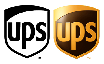
Their logo works in pure black/white. But when the medium allows, they have a nice color version that uses color, gradients and other graphic enchantments to make the logo pop. But when push comes to shove, that black/white logo could be used anywhere in any color and you’d still have no doubt of the brand. Well done UPS!
You’re probably sitting there mulling over what I’m suggesting because you probably had all sorts of colors ideas in your head and never really contemplated a purely black and white logo. Certainly, it just put a lot of restrictions on your ideas. But think of all the ‘big boy’ logos you can think of: IBM, Enron, Coke, Pepsi, Staples, Best Buy, Ebay, etc… You could easily reduce any of those logos to pure black and white. The color is there to set tone, but ultimately, it’s the shape that makes you recognize them. On the flip side, have you ever seen a Fortune 500 company with one of those artsy logos that is clearly the work of some digital artistry that could only have been done in something like Photoshop? Didn’t think so.
Another way to look at this: If you can’t draw it with a broad-tip, black magic marker, then it’s not a good logo.
(Note: When we do logos at Taoti, we adhere to this black and white policy unless our clients force us out of it. At the end of the day, it’s your money and if you insist on some 3D computer-generated image that doesn’t work in black and white, then so be it. But know that it’s against our advice for all the reasons laid out here. That said, in addition to the black-white version, we proceed through to the full color and refined version, just like the UPS logo above. So both versions would be delivered to you for use. For more information on our various logo packages and pricing, just check our website.)
Words in a Logo
If you think about it, a lot (If not most) good logos are little more than just the right font (IBM, Microsoft, Coke, GM, etc.) The nice thing about using your name as the logo itself is that you can build up brand recognition much faster because people instantly know what to call you. If you ONLY use a symbol, you’re making a bold statement in assuming that people already know your symbol well enough to associate it with your name. And let’s face it: if that is your situation, you wouldn’t be reading this article. So you probably want to have your name in the logo in one form or another. If your name doesn’t give any indication as to what you do (though ideally, it should), consider a tag line. The tag line can usually be appended to the logo in such a way that it can be included or left out with no real consequence to the overall design. Let’s consider the Staples logo:
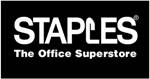

Notice how this logo is recognizable with or without the tag line. And the tag line has very little to do with the design. (One big perk here is that you can change the tag line to match company strategies, major marketing campaign themes, etc.) I want to point out something here about ‘catchiness’ of tag lines (or of any branding material). Notice in the first logo, Staples is basically taking my advice and since their name alone doesn’t say what they do, they’ve supplemented their logo with “The Office Superstore.” Well done. You look at this logo and you pretty much know exactly what you’re in for. The second logo above has a tag line “that was easy.” It’s catchy and cute. But note that Staples did not introduce this until they were a household name in terms of brand recognition. Once you get that kind of brand recognition, you too can afford to be cute and catchy. Until then, my advice is to be more descriptive because it’s more important that people know what you. Once you become a household name, then let’s talk about catchy ad campaign phrases. Until then, stick to the basics.
Sidebar: I want to take a moment to address the Staples logos above from a design point of view. I’m pretty sure it’s safe to say that if I presented those logos to client, they’d tell me to hit the drawing board. From a logo design point of view, they’re pretty unimaginative. There is nothing creative there. Even the font is rather boring. And yet, this is a major brand that I’m sure you know. And it meets all of the criteria we noted so far. By all accounts, it’s a good logo, yet I’m pretty sure you’re sitting thinking, “Yeah, he’s right… I wouldn’t have accepted this logo from my logo designer.” But are you any less likely to go to Staples because you don’t think their logo is a work of art? Are you going to take an artistic stand and patronize OfficeDepot because their logo is so much better (which it isn’t from the artistic merit point of view)? Didn’t think so. The point I’m trying to make here is that as important you think your logo is from a design point of view—the rest of the world doesn’t care. All the rest of the world cares about is that they know it’s you. As long as your logo adheres to the basic rules I’m setting forth here, it doesn’t have to be an artistic masterpiece for you to succeed in business. At the end of the day, you should focus your energy on things that really do matter (marketing, sales, products, etc.) Whether your logo is three shades of red lighter or 10 pixels wider or whatever… no one but you really cares.
(I should probably pull back from that above note just a bit and say that when we do logos, we very much want you to fall in love with it and will do everything in our power to make that happen. We understand that sometimes, it’s that personal connection to your business that makes businesses succeed, so we’re not suggesting you should just throw up your hands and settle for anything. I’m merely trying to illustrate the point that it’s far more important that your logo adheres to my ‘good logo rules’ than it is a work of art. And while some back and forth is good and necessary, you needn’t lose sleep at night worrying about minor details that no one other than you will really care about.
I think that’s enough logo soapboxing for today. If you’re in the market for a logo, go look around at lots of examples. There are plenty of portfolio sites out there (including our own – click here!) When you’re ready to pull the trigger, talk to your chosen developer. Make sure you feel comfortable not only with their past work but with how they handle you as a customer. (Hint: these “3 logos in 24 hours for $99” deals are… well, you get what you pay for.) Talk to them about my black/white stuff. Usually, that issue separates the professional marketing people from the guys that are simply a photoshop whiz. And you want someone with the big, long-term picture in mind working with your branding. If at all possible, make sure your logo designer is on board for the rest of your printed collateral material (business cards, letterhead, etc.) and even your website. (Asking two artists to work on the same project is a bit like trying to get two different authors to pen the same book: too many chefs in the kitchen.)
If you need a logo developed, contact us.
