To stand out is to be easily noticeable—to be different. In the business world, standing out effectively is to differentiate yourself through elevation—to find your lane and put your foot on the gas.
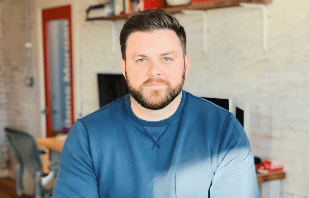
Security First Insurance, based in Florida, partnered with our team at Taoti for their most recent website redesign project, and the results are moving needles. We sat down with Drew Ellis, one of our Art Directors, to discuss the approach he took in designing and illustrating Security First Insurance’s new website. We discover how illustration played a pivotal role in translating a product, and how Garfield—yes, that Garfield—had a part to play.
What challenge was Security First Insurance trying to overcome?
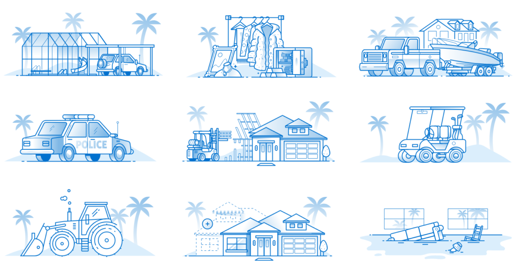
They were looking for a website redesign which would improve their business with current and prospective clients. They’re competing with the big, national insurance companies that have really well-established brands, and their challenge was that they weren’t really standing out from those other insurance companies. Our whole goal has been to show consumers why Security First Insurance is the best choice for their needs, and we did so by creating unique illustrations on their website.
How did you settle on illustration as the answer?
The Security First brand is really well established, and has a strong sense of playfulness and creativity, so we really embraced that and just worked to elevate the execution of that brand on the website. If you look at some large insurance brands like Progressive or Esurance, they have some playfulness as well, and that’s really because the subject matter of what they’re selling. Insurance is so serious—so much of it can be tied to bad things happening to you or your property—that being light-hearted is a great way to welcome people to the brand in a meaningful way.

What was the inspiration behind the illustrations?
Really a combination of a lot of things … we looked at competitors, worked through some mood boards, and talked about several different illustration styles. Security First really wanted to convey that they’re based in Florida, so we wanted to emphasize that in the illustrations. If you look at the homepage, you get a strong feeling of being in Florida, complete with palm trees, the ocean, and the skyline right in the background—look close enough, and you might just see their building.
Is custom design like this really that important?
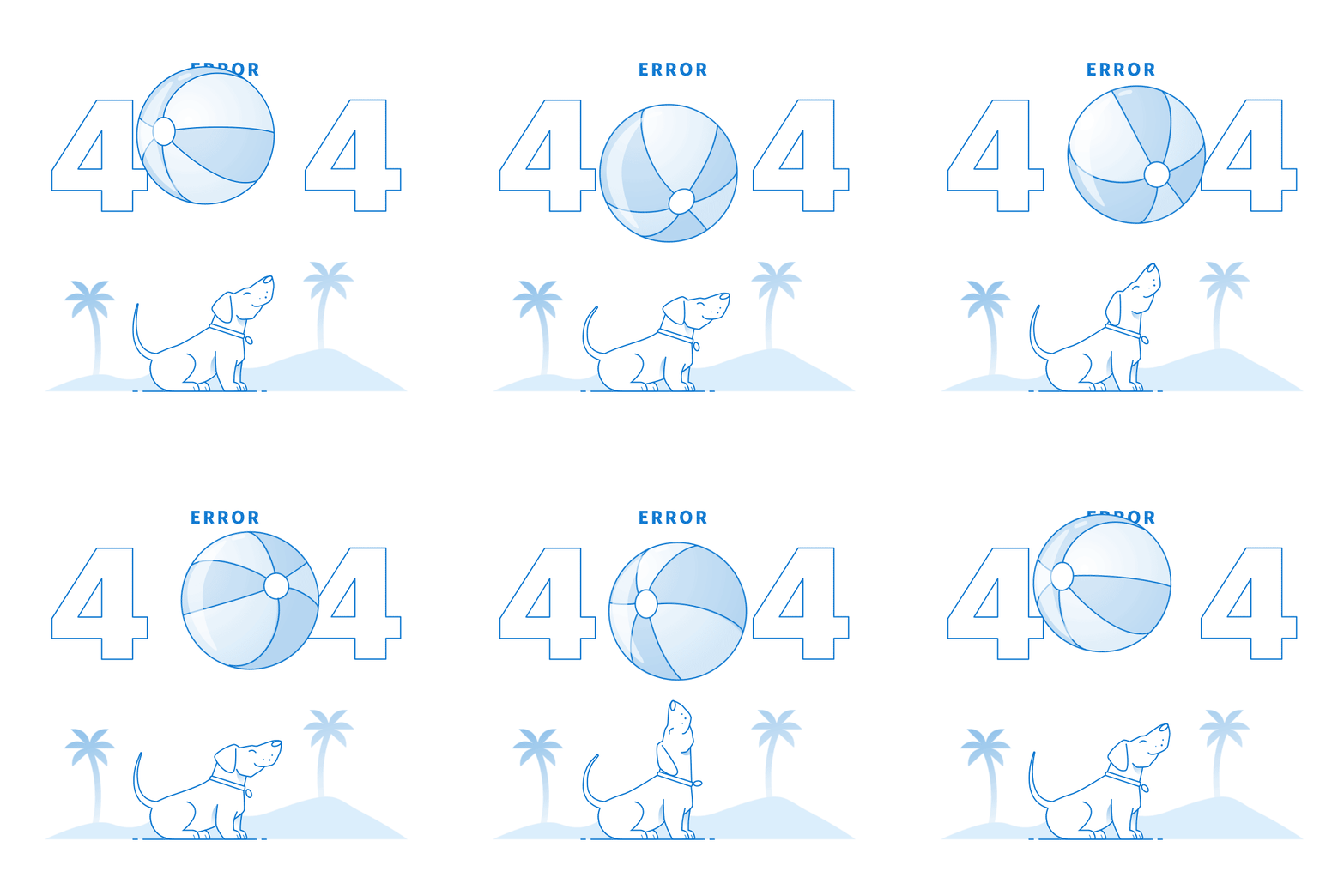
Short answer: yes. It adds value for our clients—making custom illustrations is powerful because no one else has them, and they’re unique for a brand. In a world where you have all these templates, providing custom illustrations through programs like Adobe Illustrator is something you just can’t get easily, so it’s something I really love to provide for our clients.
How’d you get started illustrating like this?
As a kid I was always drawing. The earliest drawings I remember well were of my favorite cartoon characters. So, I used to sit and draw Garfield and Odie, and I guess my path took off from there.

Think you’ve got what it takes to be part of our Dream Team? Want to work with us? Reach out to us and tell us about yourself! You can also check Taoti—and our awesome work/team—out on social media: @TaotiCreative.
