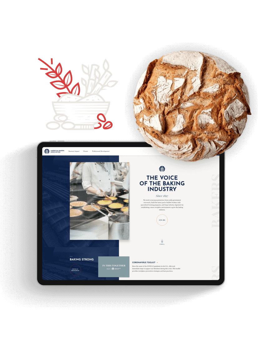
The American Bakers Association (ABA) is the premier association for the wholesale baking industry. Since 1897, ABA has represented the interests of bakers before the U.S. Congress, federal agencies, and international regulatory authorities. Being an organization with over a century of history, they decided to partner with Taoti, an award-winning creative agency, to revitalize their brand and website.

A New Image for a Century-Old Organization

Problem
The ABA users are usually members, part of the workforce, and people looking for information about the baking industry in the U.S. After extensive research and several interviews with users, our team understood the ABA website needed a more intuitive user experience. It was also crucial for users to have a clearer message of who they are and how they advocate for association members.
Solution
Our team created an image that showed what ABA provides to its members and community as the voice of the baking industry in the U.S. The UX was also completely revamped so that users can now find the information they need faster.

The Perfect Design for an Intuitive Website
Our team designed a unique iconography for the website and included several animations throughout, making it come to life. It also encourages users to click on certain links and makes information accessible for everyone. The new and modern layout increases usability and makes it easier to read. In fact, since the website launched, its traffic has doubled and sustained.

A Brand to Match the American Bakers Association Mission
After extensive research on the brand and logo front, our creative team developed a consistent brand and painted a clear picture of ABA and its mission. ABA’s new brand is modern and shows the association is forward-thinking in an ever-changing industry.
