Accessibility

Art Meets Science

PhRMA Foundation

PhRMA Foundation

The First Impression

A logo is the face of a brand. It communicates its style, taste, and feel. When crafted successfully, it contributes to an organization’s narrative. For the PhRMA Foundation, the logo also needed to capture the essence of the foundation’s unique mission statement.

The PhRMA Foundation’s ambitious vision is to create a healthier world where all people have access to life-changing medicines. They invest in today’s scientists for tomorrow’s breakthroughs.

The PhRMA Foundation hired Taoti to design an innovative logo, sparking a full rebranding of the organization and the development of an award-winning WordPress site.

A grid of website screens with a platinum trophy from the doctcomm awards in front.
PhRMA Foundation 1

The Sparkle

The design team retained the Italicized ‘h’ in ‘PhRMA’ as a nod to the brand’s heritage. In the word, ‘Foundation’, the design features a custom wordmark with an elliptical orbit of spheres converging at the “i”, symbolizing the ‘spark’ of a new idea. The PhRMA Foundation serves as a catalyst for change and has real impact on real people.

In addition, we created a brand logo featuring an abbreviated wordmark. Drawing inspiration from elements on the periodic table, this acronym design is ideal for small spaces, favicons, watermarks, and internal brand collateral.

PhRMA Foundation Logo in a grid outline of feature against a dark blue background
A grid of four color blocks, two blocks with the acronym

The Science of Brand Building

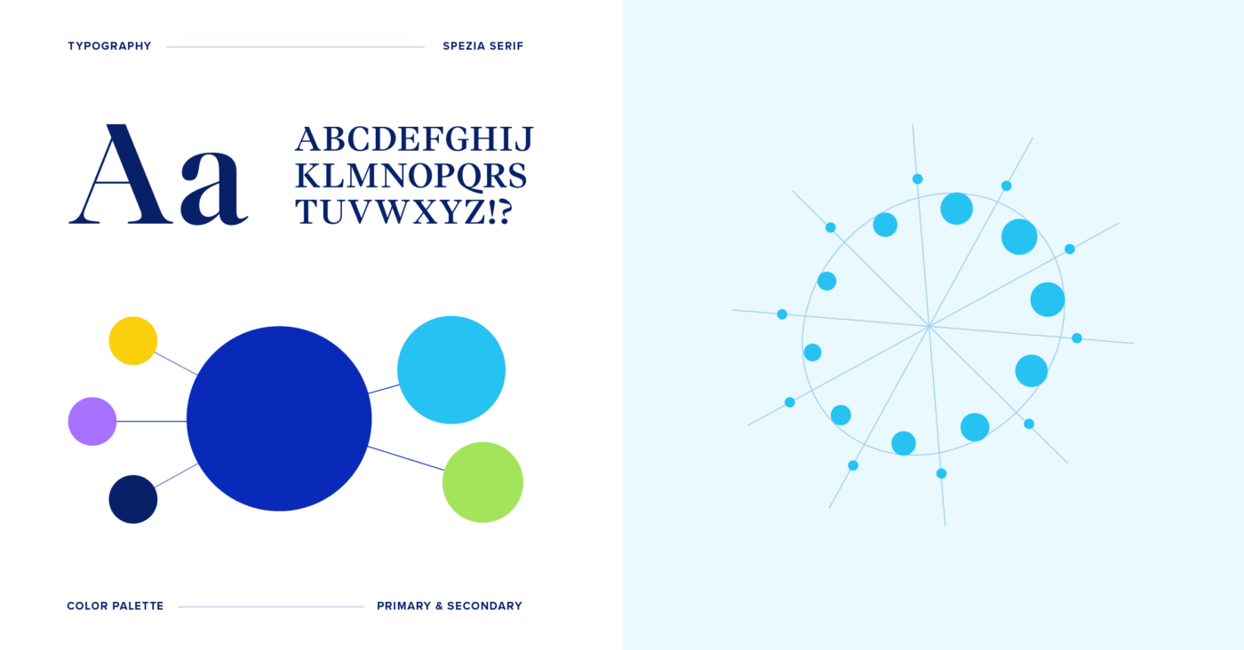
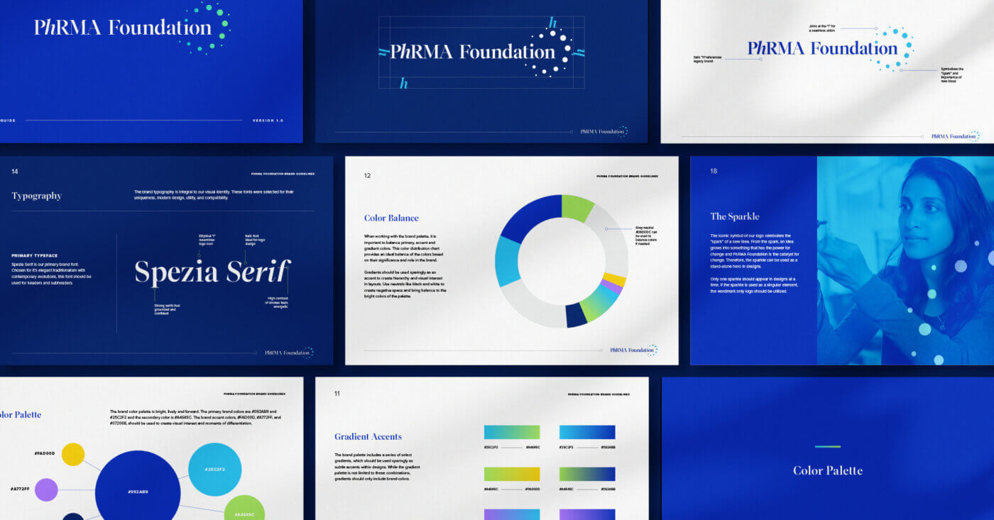
From the onset, our clients’ shared a passion not just for their mission, but also a pure love of scientific discovery. We harnessed their vision to infuse the brand design with this connection.The brand’s color scheme is bright, lively, and forward with an analytical leaning. To showcase the range of the scientific process, the brand palette features a selection of gradients that should be used for subtle accents within designs.

The brand’s typography was selected for their uniqueness, modern design, utility, and compatibility. Spezia Serif is the primary brand font, selected for its elegant traditionalism with contemporary evolutions, for headers and subheaders.

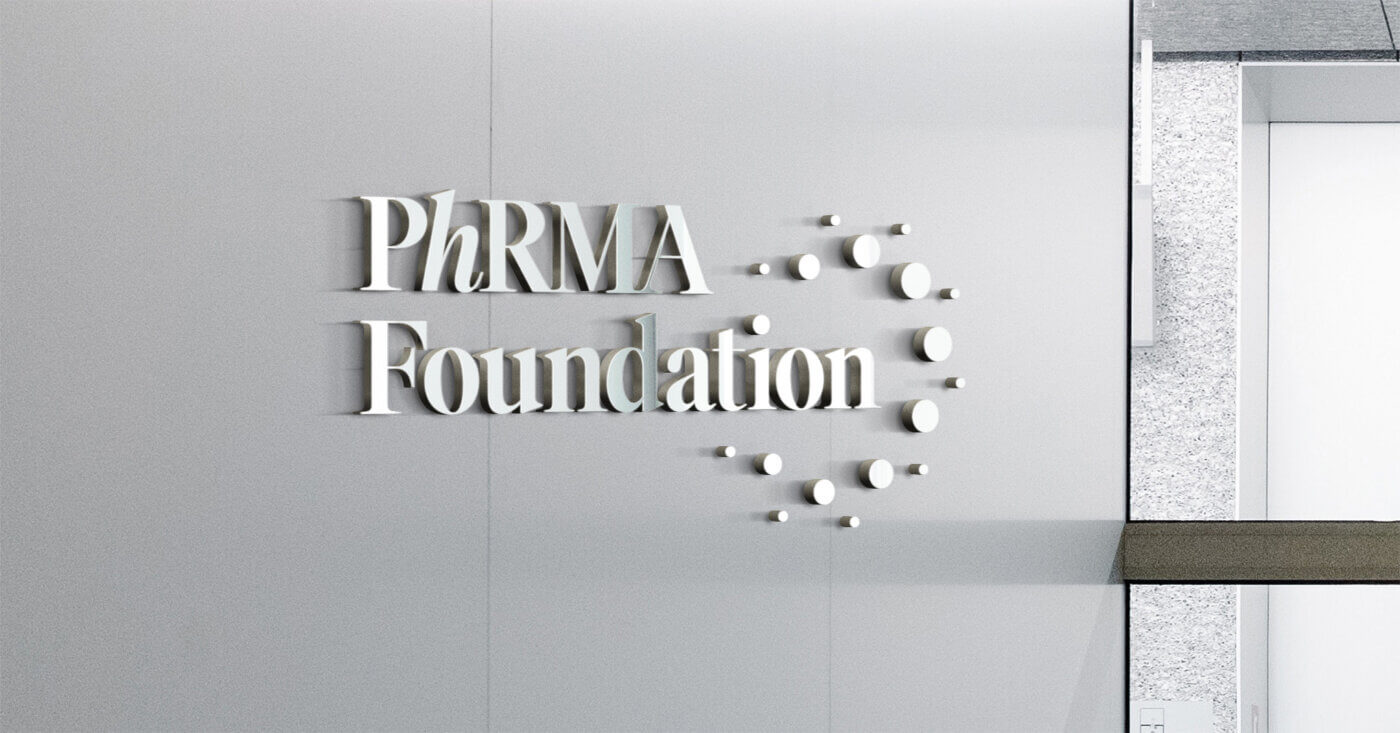
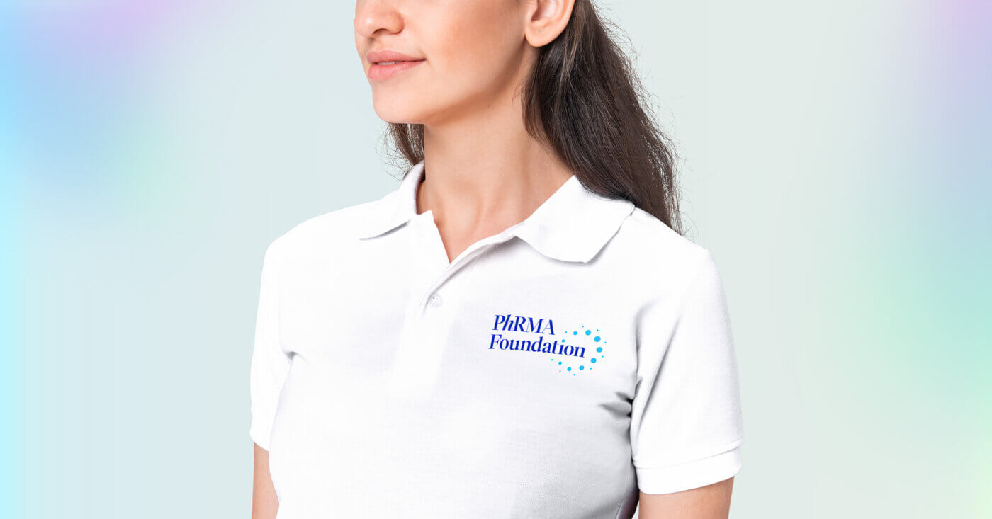
Molecule graphics were designed in our brand colors to be used as accents throughout the brand, strengthening the link to the organization’s passion for science. Building upon this language, custom icons were designed to be utilized for brand collateral. The icon style is approachable, organized, and open, featuring geometric shapes, negative space, and rounded lines.

From there, we developed a WordPress website that built off the molecular graphics to embodying the foundation’s commitment to scientific progress. Key functionalities, such as donation options, updates on medical advancements, and information on grants and research, enrich the user experience and further the foundation’s critical mission.

A side by side of visual of elements from the brand design, including type samples, a color palette, and an outline of sparkle design grid.
A series of page designs side-by-side showing the contents of the PhRMA Foundation brand guide design
  • A mockup of laptop with the new PhRMA Foundation website design
  • A mockup of a smart phone with an app start-up screen with the PhRMA Foundation logo centered in the screen
  • A three-dimensional mockup of the new PhRMA Foundation logo signage against a white office space.
  • A mockup of a woman wearing a white polo shirt with the PhRMA Foundation logo in the corner